
The Wonderwood
Style System
Fun isn’t more sparkles. It’s physics, voice, and a world.
The definitive hub for how WonderCast looks, moves, and speaks — with the cast, the curves, and the rules, demonstrated live on this page.
Saturday needs
a story.
Corin fed his stuffed fox breakfast again. Fern has ideas about that.
 One character, one corner
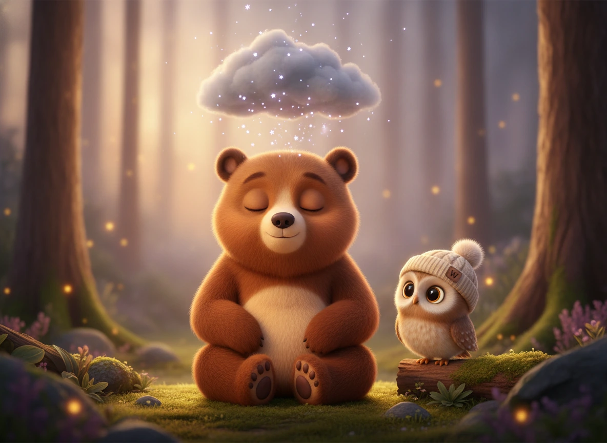
After seven, the Wonderwood whispers.
Slower motion. Softer colors. No bounce. The night palette winds a family down — it never winds them up.

moment-bedtime.webp — the night mood board
Color recipes
Nobody designs with a swatch — you design with a combination. Six named recipes; every surface on the site should be one of them.
“Corin tiptoed past the moonberry bush…”
Keep readingSame card, two worlds
Same words, same price, same layout. The difference is the world.
The curated library of stories and songs.
Every story and song in the Wonderwood, waiting on the shelf.
How a Wonderwood page is built
- 1Start on warm paper. Cream + grain is the ground truth. White is for cards, never for pages.
- 2Give every page one night band. A deep-violet section resets the eye and earns the next warm one. One per page.
- 3Divide with squiggles, not lines. The hand-drawn divider is the page rhythm. Retire the 1px hairline.
- 4Spend the rainbow once. One reveal moment per page — story ready, hero CTA. If everything is rainbow, nothing is.
- 5One character, one corner. A single cast member per viewport, at an edge, eyes visible. Two characters is a scene; scenes belong in stories.
Meet the cast
Three residents of the Wonderwood — the whole brand walks on their feet
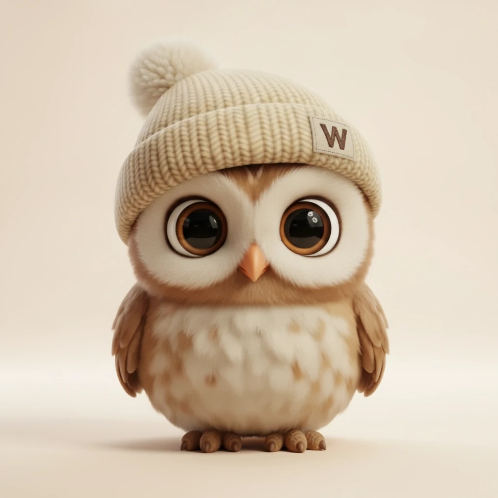
Wondy
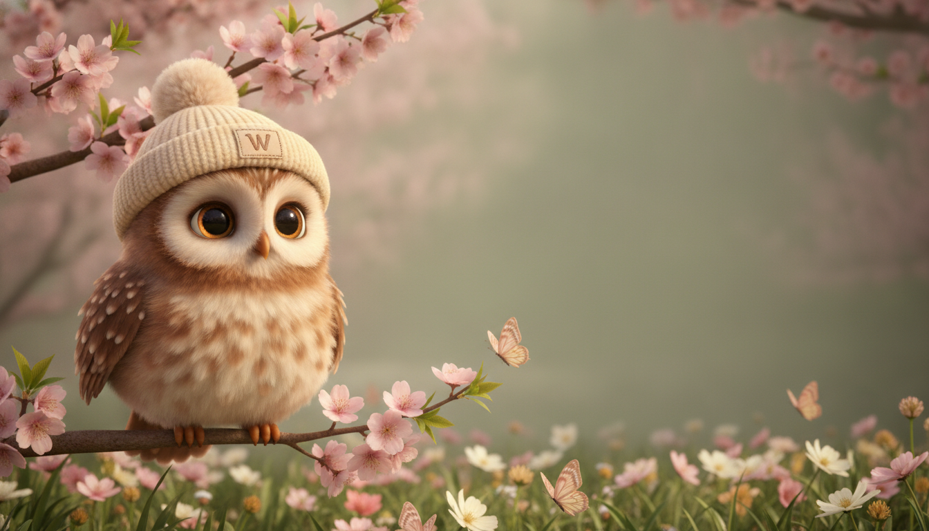
OwlCosy, bedtime-soft, and endlessly patient. Wondy always finds the kind way forward — he lights the lantern, he never rushes the page.
Fern
FoxFern names the scary thing out loud — and then walks toward it anyway. She is how the brand talks about fears without pretending they aren’t real.

Bruno
Bear cubBig feelings in a small bear. Bruno learns — slowly, honestly — that every feeling has a name and a place to go.
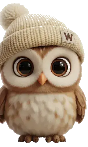
Wondy’s pose library


Character usage rules
- Minimum render size is 48px. Below that, use the logo — not a squashed owl.
- Never stretch, skew, or recolor character art.
- Clear space: one head-width on every side.
- Eyes stay visible in any crop.
- Feet may be cropped only at card edges — that’s the "peek" pose, and it’s the only sanctioned crop.
- Wondy never appears next to the color red — errors and destructive actions are his no-fly zone.
- Characters appear only where the moment is a delight moment: empty states, waits, celebrations, 404. Never near payments, legal, consent, or safety screens.
Motion: two curves, three primitives
The whole brand moves on exactly two easings — click a card to replay its demo
Glide
--wondy-glidecubic-bezier(0.16, 1, 0.3, 1)Air. Entrances, drifts, hovers — anything on the wing. Fast start, long soft landing.
Bounce
--wondy-bouncecubic-bezier(0.34, 1.56, 0.64, 1)Landing. Arrivals, presses, celebrations — the overshoot is the perch settling under a little owl weight.
animate-perch-idleambientA 1.5% breathing loop, 4s. Reserved for character art only — it’s alive, not animated.
wondy-hoversite-wideThe hover lift: -3px and a half-degree tilt, like a wingbeat. Every card in this section wears it.
The physics — non-negotiable
- Transform and opacity only — no layout properties, ever.
- Motion never gates content paint. The page is readable before anything moves.
- Every animation has a static end-state. Nothing loops except ambient idles.
- Fully disabled under reduced-motion — the kit checks both the OS setting and the in-app toggle.
The dusk rule
After 7pm this is a bedtime brand. Motion gets slower and softer, and the bounce goes to sleep — nothing pops at a wound-down child.
Voice: Wondy talks, the UI doesn't
Three tone tiers — and a hard line between the character and the chrome
Wondy voice
- • First person, 1–2 sentences
- • Verb-led, present continuous
- • Wonderwood vocabulary: lanterns, fireflies, moonberries
- • Always ends with a kind next step
- • Used for: empty states, loading, celebrations, 404
Warm neutral
- • Friendly but factual
- • No character, no metaphor
- • Used for: limits, forms, settings
Plain
- • Clear, complete, unadorned
- • States what happened and what to do
- • Used for: payments, legal, safety, errors
Never say
- "Generating", "Processing", "Error", "Invalid", or "Failed" on any Wondy-voice surface.
- Guilt mechanics. No sad mascot for lapsed users — ever.
- "Magic" when something broke. Broken things get plain words.
- Exclamation marks in failure states.
The one rule
Wondy speaks only when his face is visible.
No disembodied whimsy. If the owl isn’t on screen, the copy isn’t his.
Storybook texture kit
Four surface classes — all demonstrated by this page as it exists
wc-paperWarm cream surface with a 2% grain. Section-level wrapper — the storybook’s page.
wondy-hoverA wingbeat lift on hover, feather-soft settle on press. Cards stay straight — the life is in the motion, not the angle.
wc-stickerWhite-outlined badge with a 2° tilt. Tier labels, “new” tags, achievements.
wc-squiggleThe hand-drawn separator. Replaces horizontal rules on marketing surfaces.
The reveal recipe
The warm gradient — #ffd54d → #ff9e4d → #ff5d8f — is reserved for moments of reveal: a story is ready, the hero CTA, the first page turn. Never on chrome: no gradient borders, nav bars, or button rows. If everything glows, nothing does.
This rule used to say rainbow. It was wrong twice over: the live site paints no rainbow gradient anywhere, and the spectrum belongs to the logo mark alone.
Color & typography
The palettes, the character bindings, and the two typefaces
Character accent bindings
These are the live values. Each swatch is a CSS custom property shipping on www.wondercast.app today. If a value here disagrees with the site, the site is right and this page is stale — please open an issue rather than matching the page.
Night — the ground everything sits on
Sky — the sunset, top to bottom. The brand’s signature.
Light (lanterns, firelight)
Paper & quiet (+ the one cool accent)
Rainbow Prism — the logo mark, and nothing else
The spectrum lives on the W tile — the 32px mark in the nav, the favicon, the app icon. It is an identity mark, not a palette. Rainbow gradients on headlines, section dividers, page backgrounds or card borders are off-brand: the product’s world is dusk, and the mark is the one bright thing in it.
Typography
WonderCast turns real parenting challenges into personalized, AI-generated stories that help children understand emotions, overcome fears, and build character.
Every story is unique. Every child is the hero. Every night, a new chapter.
The fun/no-fun map
Delight is a place, not a coat of paint — here is exactly where it lives
Where fun lives
- The 404 page
- The empty library
- The generation wait
- Celebrations — story ready
- Nav & footer
- Pricing — the Wondy tier
Where fun is banned
- Safety screens
- Consent & photo flows
- Checkout & payment errors
- Account deletion
- Error toasts
- The book-reader canvas — the child’s story is the star, not ours
These surfaces use the Plain voice, no characters, no texture kit, no rainbow — competence is the comfort here.
The IP separation rule
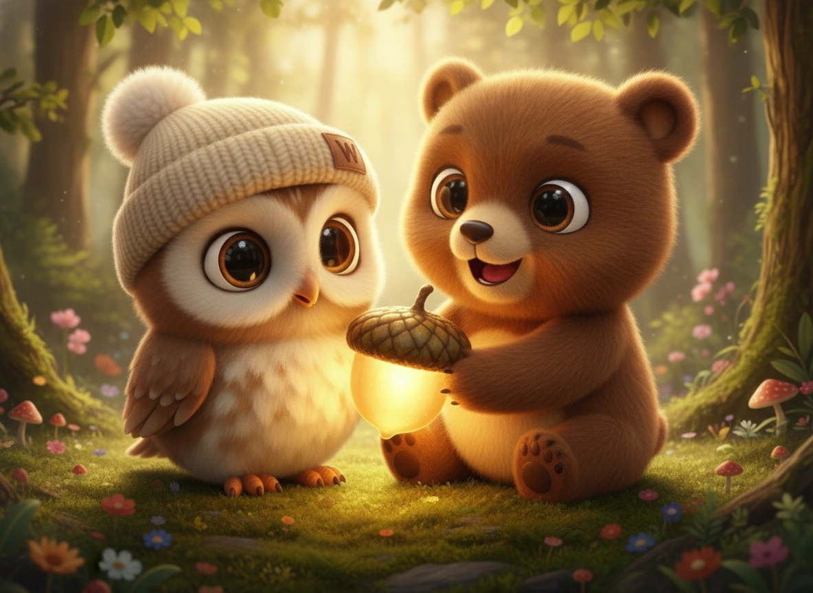
The Pixar-style “Julius” art is partner-deck-only — it never appears on the website. On product surfaces it blurs the line between our IP and your child’s generated art, and that line is the product.
Going forward: the rollout
Ranked by the creative panel — highest leverage first
- 1
Naming pass
SalesChat "WonderCast Guide" becomes Wondy; "Chat with Narrator" becomes "Chat with Wondy".
- 2
The 404 page
Currently a silent redirect. It should be lost-Wondy with a lantern — the single best canvas we own.
- 3
Wondy art on the Wondy tier
The $3.99 pricing tier that carries his name shows a generic star icon. Put the owl on it.
- 4
Nav owl with perch-idle
The header avatar gets the ambient breathing loop — alive, not animated.
- 5
Agent theater recast
Safety Bot becomes Bruno, Paint Bot becomes Fern. The generation wait becomes a Wonderwood scene.
- 6
Onboarding loader pose-per-copy
Each loading line pairs with a matching Wondy pose instead of a spinner.
- 7
Library empty state
Wondy asleep on an empty shelf — the warmest possible "make your first story".
- 8
Texture layer on Landing & Pricing
wc-paper sections and squiggle dividers roll out to the highest-traffic pages.
- 9
Bedtime mode
Post-7pm night palette. Slower, softer, no bounce — the brand keeps the house rules.
- 10
A layered Wondy rig
Commission an SVG/Lottie rig. All current art is raster — the ceiling on real animation.
Downloads & marks
Design tokens, the canonical marks, and the pre-Wondy archive
 Canonical
Rainbow Prism W
The logo — a bright white W with prismatic rays bursting outward. This is the current favicon and app icon.
CanonicalWondy
The brand character. The storybook trio art and the casual owl pose set (above) are the sanctioned renders.
View full sizeThe logo
The Rainbow Prism W — a white W on a rainbow starburst. This is the only WonderCast mark. It is what ships in the nav, the favicon, and the App Store icon.
 WonderCast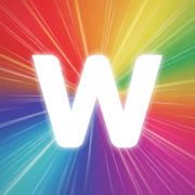
- Keep clear space of at least half the mark’s width on every side.
- Minimum size 20px. Below that the W stops reading.
- Wordmark is Plus Jakarta Sans 800, UPPERCASE, -0.01em, set at 1.12rem beside a 28px mark with a 0.55rem gap. Note it is the body face, not Outfit.
- Use the full-colour mark on both light and dark — it is built to hold either.
- Don’t recolour, flatten, or re-cut the starburst.
- Don’t place the mark on a busy photo without a solid tile behind it.
- Don’t stretch the lockup or re-set the wordmark in another face.
- Don’t reinstate the wizard-hat mark. It is retired, it is not WonderCast, and it is no longer offered here.



The Wonderwood Style System · Brand Kit 2026.07 · Confidential
For internal use and authorized partners only.